The AppSec How -To:
Visualizing and Effectively Remediating Your Vulnerabilities: The biggest challenge when working with Source Code Analysis (SCA) tools is how to effectively prioritize and fix the numerous results. Developers are quickly overwhelmed trying to analyze security reports containing results that are presented independently from one another.
Take for example, WebGoat – OWASP’s deliberately insecure Web application used as a test-bed for security training – has more than 100 Cross-Site Scripting (XSS) flaws. Assuming that each vulnerability takes 30 minutes to fix, and another 30 minutes to validate, we’re looking at nearly three weeks of work. This turnaround is certainly too long and costly- and even impractical- for large projects containing thousands of lines of code, or for environments with quick development cycles such as DevOps. With such a large amount of vulnerabilities, it should come as no surprise that vulnerable and unfixed code is released.
In this article, we show how visual insights into the vulnerability – from origin to impact – can help developers to:
- Picture the security state of their code
- View the effect of fixing vulnerabilities in different locations
- Automatically narrow down the results of extra-large code bases to a manageable amount
In fact, using this method we were able to cut down the number of fixing locations of WebGoat XSS vulnerabilities to only 16 – even without looking at the code.
(Read more: Annual Survey on Cloud Adoption Status Across Industry Verticals)
A Picture is Worth a Thousand LoC: Visualizing Your Vulnerabilities
“Know your Enemy” is the mantra of any security professional. It defines what they’re up against, how to face it and what tactics to employ. It sets the groundwork for all future outcomes. The same goes for developers – and the enemy is vulnerable code. In the practice of secure coding, developers should receive an overview of the security posture of their code, the amount of vulnerabilities contained within the code and how they manifest themselves to the point of exploitation. This is where the graph view comes in.
The Basics: Data Flow
A data flow is best described as a visualization of the code’s path from the source of the vulnerability until the point where it can be exploited (aka “sink”). As you can see, each step in the flow is reflected as a node in the graph:

Traditionally, each vulnerability result has a single data flow – independent from other findings. Accordingly, for numerous results, say 14 different vulnerability findings, we can view a graph with 14 separate flows:
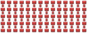
Obviously, such a graph does not help much in understanding how to prioritize fixes. What developers really need is to understand the relationships between the different flows and simplify the resulting graph as much as possible.
(Read more: Annual Survey on Security Budget Analysis Across Industry Verticals)
Improving Visibility: The Graph View
The graph view takes those separate data flows and depicts them in a way that easily presents the relationships between flows.
Building the graph is a two-step process:
1.Combine the same node appearing in multiple paths. In other words, identify and merge those pieces of code that are actually shared by the same data flows. Taking the 14-path graph from above, consider the case where the 5 leftmost sources share the same node. In turn, this node shares with another node on its level a node closer to the sink:
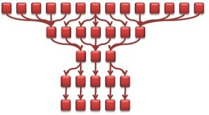 2. Simplify the graph to reduce the number of data flow levels. This can be done by combining similar-looking data flows to a single node. For those familiar with graph theory, you might recognise by now that we’re building the “homeograph” of the original graph, i.e., a graph with an identical structure but with a simplified representation.We do this by first grouping the nodes:
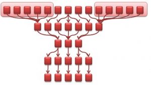
As we continue this process the resulting graph eventually looks like this:
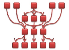
With this simplified graph flow we now have a visual mapping of the security of the code. Moving away from just looking at code bits and at seemingly disparate code flaws, the graph flow actually allows us to see the correlation between vulnerabilities. Furthermore, a quick glance at the graph provides us with a deep understanding of the effect that a certain vulnerability has over the rest of the code – a relationship that’s much too intricate to understand through a code review.
The Butterfly Effect: Considering Fixing Scenarios
What if you fix the code in a certain location? How will that affect the code? How about in another location? With the graph view in hand, we can consider all these scenarios, see the overall effect quickly, and decide for ourselves which route to take.
Let’s look again at our simplified view (aka “homeograph”) of our original example. A fix of the single node pointed to by the arrow results in fixing two separate paths.
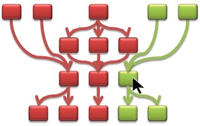
On the other hand, the following graph shows what happens if we try to fix a different node. In this case, the node pointed to by the arrow only leads to a partial fixing of the path. The reason is that the bottom “branch” of that code is also affected by other nodes that are not yet fixed.
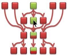
We can continue to interact with the graph and consider different “what-if” scenarios. Not only will they show us the ripple effect of fixing a certain vulnerability, but after a certain time of getting into such a habit- we’ll unconsciously understand the impact of certain vulnerabilities and invariably start to recognize our own “best places” to fix.
Only the Best: Optimizing Vulnerability Fixing
Ideally, we’d also like to accurately and automatically pinpoint those “best-fix” locations on the graph.
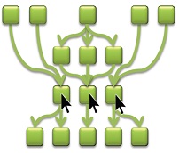
Once again, this calls for the adoption of graph-theory concepts. In particular, the “Max-Flow Min-Cut” theorem helps us to calculate the smallest amount of node updates that fix the highest number of flows. Applying this calculation to our example graph, we can visually locate those 3 nodes that if fixed -amass to rectifying the complete flow graph.
This is incredible considering that we started with a 14-path graph equivalent to 70 nodes.
(Read more: Security Technology Implementation Report- Annual CISO Survey)
Summary
Graph flows are a visually appealing way for developers and security professionals alike to fully comprehend the relationships between the different parts in the code and the propagation of a tainted piece of code to its sink.
The visualization of the code provides an interactive tool allowing the developer to proactively consider the effect of fixing various vulnerabilities at different places. Most importantly, the graph flow allows us to locate the best-fix locations in a quick, efficient and accurate manner.
Disclaimer: This report is from Checkmarx and if you want more details or want to connect you can write to contact@cisoplatform.com

Comments